Data Visualization
The value of data is amplified when it is made understandable and accessible. Our data visualization specialists work closely with our scientists to ensure that we provide customized, scientifically robust, and engaging data visualization products and tools for our clients and their stakeholders.
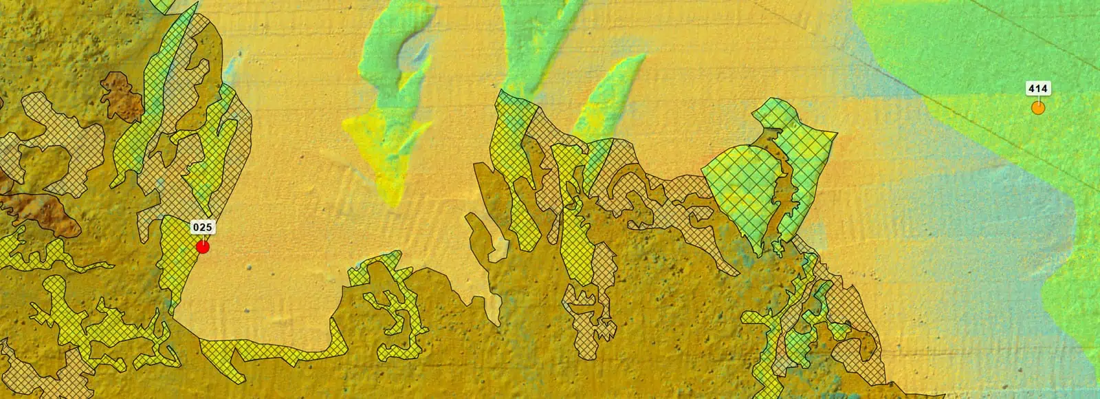
We believe in data democratization, and develop custom interactive data visualization tools that ensure data results are accessible, understandable, and transparent.
Our Popup map, an interactive data visualization tool, is known as an engaging and accessible platform for sharing data with our clients and with regulators. This platform allows users to explore multivariate data on their own and promotes transparency during permitting reviews.
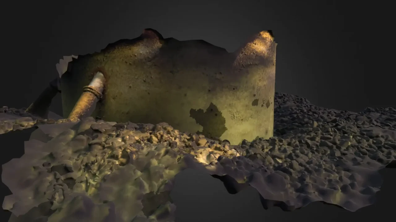
Working closely with our hard bottom benthic ecologists, our team is developing tools to support the assessment of function from structure and to communicate these results through 3-D models that can be viewed from multiple angles.
INSPIRE’s web-based interactive Popup Maps showcase how our data visualization solutions can unify diverse geospatial datasets in a user-friendly online platform to support data exploration and informed decision-making.

Our StoryMaps simplify complex data
We craft engaging, interactive reports with web-based tools like StoryMaps, making it easy for teams and stakeholders to connect, collaborate, and share insights.
Data Visualization Tools and Offerings
Customized interactive web mapping tool puts data in the hands of developers and regulators for data exploration and decision-making.
Engaging delivery of spatial data in concert with narrative text and imagery.
Graphical interface for data plots that allows users to dynamically view and interact with data results.
Three dimensional reconstructions of underwater structures and habitat.
Popup maps support site and constraint analysis, review of desktop data, and presentation of survey results.
We customize the visualization tools we use to meet each client’s needs.
Other Services

Desktop Analyses, Risk Assessment and Constraint Mapping

Data Analytics and Management
GIS

Image Analysis
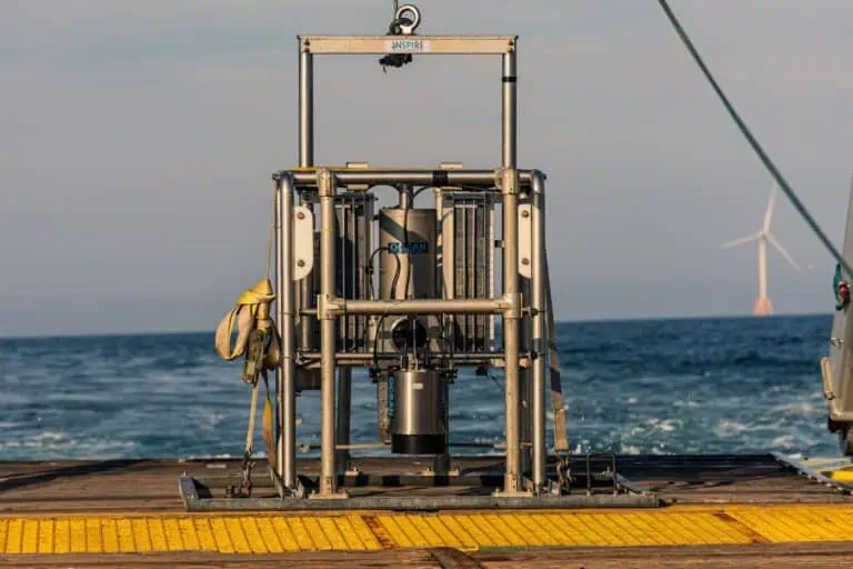
Sediment Profile Imaging/Plan View (SPI/PV) Surveys
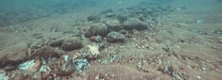
Towed Video Surveys
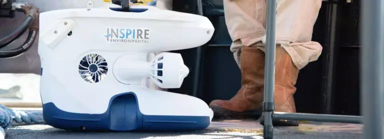
ROVs, High Resolution Video & 3D Photogrammetry

Submerged Aquatic Vegetation Surveys

Regulatory Support Services

Public Engagement

Fisheries Outreach


